Neutral Bedroom Color Palette: Hygge-Inspired Ideas That Feel Calm and Cozy
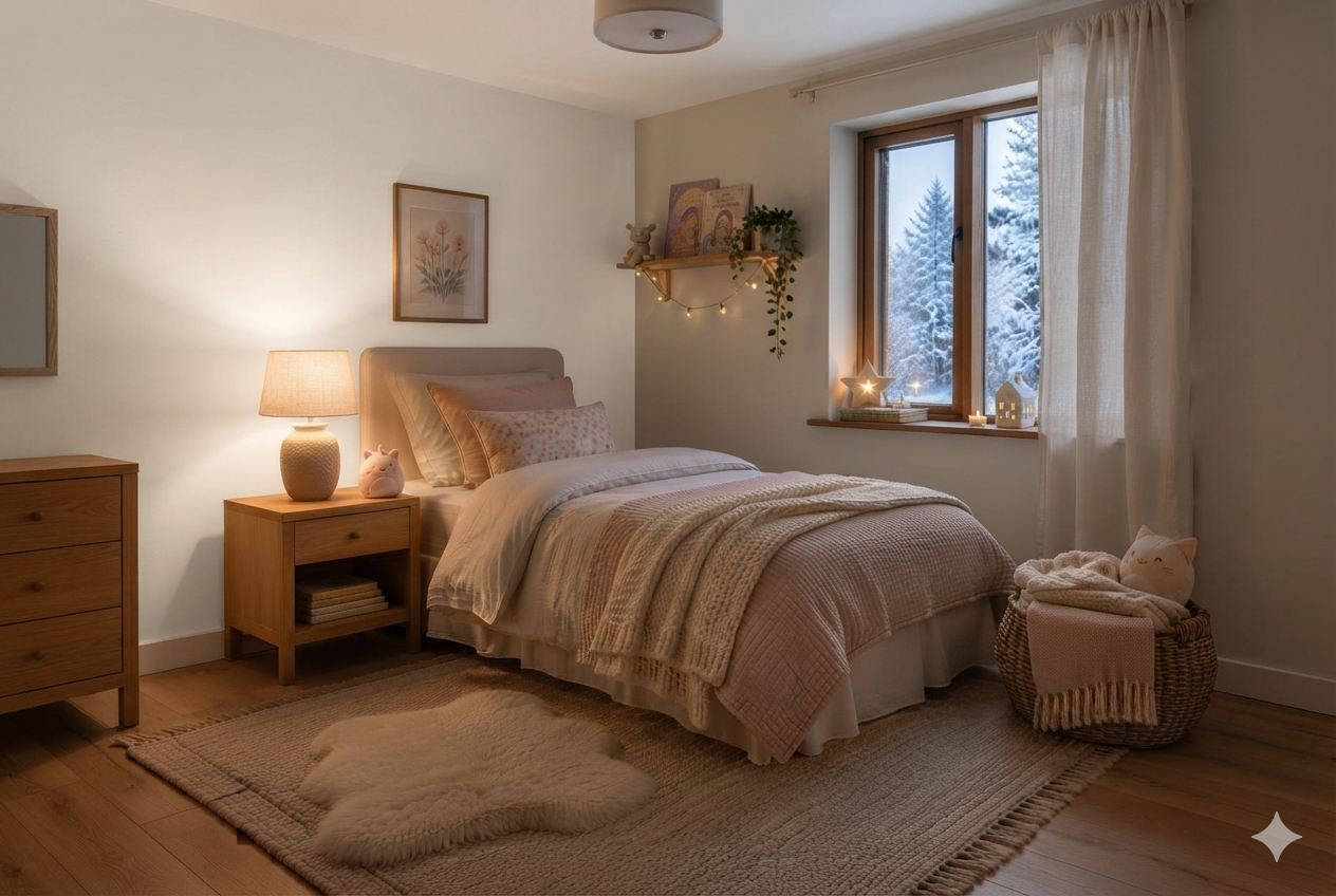
Maja picked her own paint color for the first time this year. Ten years old, and now feeling very sure of herself, she picked Benjamin Moore Sienna Clay (104). Actually, I liked it too — it is a rich blend of equal parts orange and brown.
Henrik painted the wall facing her bed. She loved it for four nights. But then on the fifth, she came into our room a little after ten, saying she couldn’t sleep in her bedroom. She just felt, in her words, “too awake in there.”
I tried to figure out the reason. The only thing that had changed was the paint color in Maja’s bedroom. So I asked my Danish friend Astrid for advice. She has a keen eye for color and a deep understanding of hygge.
She came over that evening, had a look at the freshly painted wall, and shook her head. She had cracked the problem, almost instantaneously. It wasn’t the color’s warmth. Sienna Clay is plenty warm.
It was something else entirely — a color property paint guides rarely mention by name.
This website participates in the Amazon Associates program. As an Amazon Associate, I earn from qualifying purchases. It also participates in the Impact and AWIN affiliate programs. If you buy through links on this site, I may earn a small commission at no extra cost to you. Thank you for supporting The Hugged Home.
Three Color Properties: as Explained by Astrid
Astrid sat down at the edge of Maja’s bed. I handed her a glass of red wine. This is what she told me.
Color scientists describe any paint color as having three distinct properties: hue (is it orange, or blue, or green), value (how light or dark it is — the LRV number on a paint chip), and chroma — how saturated or muted that hue actually is.
She gave me a few examples, and that certainly made it easy for me to understand the concepts. “A dark navy and a light sky blue share a blue hue but have completely different values,” she said.
Two colors can share the same warm hue and value but have different effects in a room because of different chroma values.
For example, Sienna Clay and Edgecomb Gray are both, technically, warm neutrals, but Sienna Clay has a high chroma, while Edgecomb Gray has a low chroma. High chroma colors are vivid and saturated. Low chroma colors are muted, dusty, and close to gray.
Sienna Clay is an energetic, stimulating earth tone rather than a passive, quiet neutral. While its warmth creates a cozy ambiance in active living spaces, that same high chroma means the color continues to “talk” and demand visual attention when the lights are low — making it a poor choice for a bedroom.
Most bedroom paint guides talk about LRV and undertone and stop there. Chroma is the missing third variable, and it’s the one that actually determines whether a “warm neutral” behaves like a bedroom color or a living room color once it’s covering all four walls instead of one cushion.
Warm Neutral Bedroom Color Palette: Low-Chroma Selection
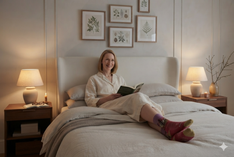
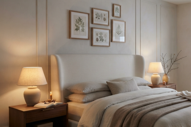
The colors listed below provide a cozy “hygge” feel by adding enough warmth to combat long winters without being so vivid that they overstimulate the mind before sleep.
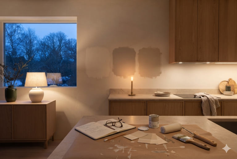
Word of caution: Colors on a digital or print medium never look the same as in real life. So, get the sample pots, paint patches, and see them in different light conditions before you decide. Check out my complete guide on Hygge Color Palette.
Benjamin Moore Warm Neutrals for Bedrooms
Edgecomb Gray (HC-173)
A restful choice leaning beige. Low saturation allows it to recede, helping the mind “let go” at night. Ideal for a quiet, relaxing space.
Buy PaintAncient Oak (OC-20)
Light and elegant neutral with subtle warmth. Part of the Woodland Charm palette, providing a soothing, organic feel for cold winters.
Buy PaintBalboa Mist (OC-27)
An endlessly versatile neutral creating an instant hygge atmosphere. Effective in northern climates as it doesn’t feel heavy in low winter light.
Buy PaintWhite Dove (OC-17)
A soft, warm off-white that avoids a clinical look. It adds subtle depth and ease to a bedroom while maintaining a bright, light feel.
Buy PaintStone Hearth (CC-490)
A stony warm gray with a hint of taupe. It adds significant depth and texture, creating a comforting and grounded vibe for any room.
Buy PaintWhy These Colors Work for Restful Sleep
- Low Chroma for “Quiet” Walls: High-chroma (highly saturated) colors, like Sienna Gray, can keep a child or even an adult “too awake” by constantly stimulating the eyes. Low-chroma neutrals like Pashmina (AF-100) or Edgecomb Gray “stop talking” when the lights go off, allowing for better rest.
- Fighting the Winter “Starkness”: Winter light can make cool-toned grays (like Stonington Gray) feel “stormy” or cold. Warm-toned neutrals provide a “snug” feel that counters the cold outdoor environment.
- Adaptability to Lighting: Choosing a “greige” (gray-beige) like Revere Pewter (HC-172) or Wish (AF-680) offers a soft, elegant look that doesn’t lean too heavily into cold winter light conditions.
Why “Warm” Isn’t Enough for a Bedroom
The living room in our house gets to carry a dose of real color — a rust cushion, a moss throw. [→ Earthy Color Palette Ideas for a Hygge Living Room] That works because the living room is for activities — talking, reading, watching TV. A little visual stimulation suits it.
The purpose of a bedroom is exactly opposite. The decor is not supposed to hold your attention. It’s supposed to let go of it.
And that’s where Sienna Clay went wrong on Maja’s wall — not because it was warm, but because it was too vivid; the chroma value was high.
Hygge Bedroom Color Palette for Winters: What to Avoid
When choosing a warm neutral bedroom color palette specifically for the cold winter season, aim to create a “hygge” sanctuary that counters the harsh outdoor environment.
Avoiding certain common pitfalls can prevent your bedroom from feeling cold, flat, or overstimulating.
1. Avoid Stark, Brilliant Whites
- The Reason: Pure, bright whites can feel clinical, cold, and void of personality during winter.
- The Winter Effect: Because winter light has a higher blue tone, bright whites can take on a blue or gray undertone, appearing less crisp and more chilly rather than bright and airy.
2. Don’t Overlook Undertones
- The Reason: A neutral isn’t just one color; it has an underlying bias. Ignoring these can make a room look “dirty” or depressing on gray winter days.
- What to Skip: Avoid neutrals with green, gray, or blue bases. In winter light, these bases risk looking cold, drab, or flat. Instead, prioritize warm undertones of red, yellow, or pink to soften the room.
3. Skip Cool-Toned Grays and Pastels
- The Reason: Grays with blue or green undertones can feel especially dreary in winter. Similarly, cool-toned pastels like icy blues or pale greens will amplify the season’s chill.
- The Winter Effect: What looks tranquil in bright summer light can lose its vibrancy and may feel overly muted and chilly when the sun is lower and light is weaker.
4. Avoid Highly Energizing or High-Chroma Colors
- The Reason: Bright reds and oranges are often considered the worst colors for a bedroom because they are highly energizing and can be too stimulating for a sleep environment.
- The Impact on Rest: Highly saturated (high-chroma) colors keep the mind “active” and alert, which is the opposite of the “receding” and “quiet” effect needed for a restful hygge bedroom.
5. Don’t Rely on a Single Shade
- The Reason: Repeating a single neutral tone across walls, decor, and upholstery can make the room look flat.
- The Better Approach: Build a range within the same palette. Using multiple tones within a warm neutral family adds depth and allows different elements of the room to stand on their own while still feeling cohesive.
6. Don’t Try to “Fix” a Dark Room with Light Paint
- The Reason: Painting a light-starved or north-facing room white to make it feel brighter often fails. Without enough natural light to reflect, the white can look dull, sad, and flat.
- The Better Approach: In naturally dark rooms, consider embracing the moodiness with deeper, warmer tones like taupe or warm gray to create a snug, cozy hideaway.
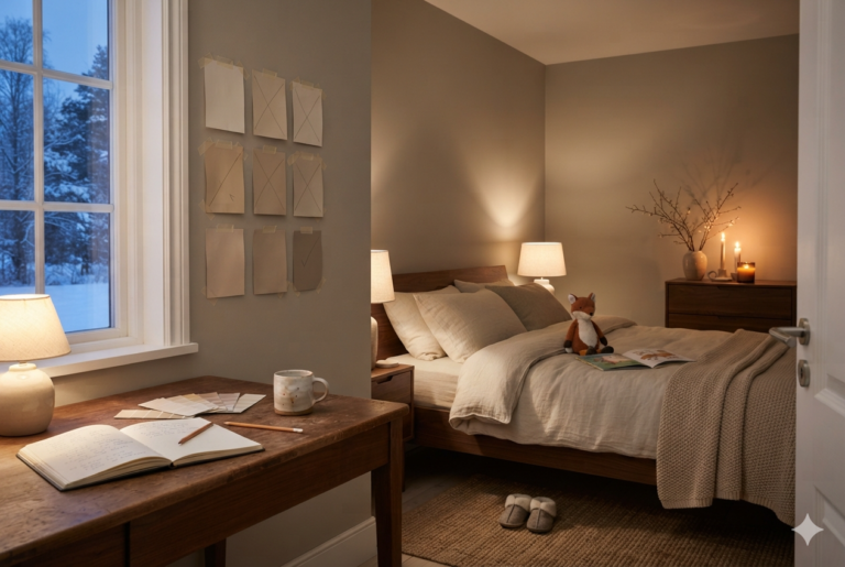
How We Fixed Maja’s Bedroom
Later that night, I explained whatever Astrid had told me to Henrik, he had a simple three-word reply: “Let’s do it.”
The same weekend, he went to the store, bought the tools, primer, and a few cans of paint in the right colors.
Then he lightly sanded the Sienna Clay wall to remove any texture from the previous application. This should promote better adhesion. For good measure, he cleaned the wall with a damp cloth to remove dust and let it dry completely.
Next, he applied Benjamin Moore Fresh Start High-Hiding All Purpose Primer (046). Unlike standard primers that only seal, this primer is designed to hide dark colors and prevent them from bleeding through.
Using a high-quality roller, he applied two coats of Edgecomb Gray (the shade Astrid had suggested). Then he painted two adjoining walls the same shade.
For the wall behind the bed headboard, we chose White Dove. It is a soft, warm white that creates a relaxed feel, just enough contrast to make the Edgecomb Gray look intentional and warm in the cool winter light.
Maja has been sleeping well ever since. She told us that the room was “done talking.” We get it.
For the full color philosophy behind every room in this house — the four-day test, the two anchor rules, and how it all fits together — see the complete guide: Hygge Color Palette.
Light a candle. Slow down. Hygge.
— Elise