Earthy Color Palette Ideas for a Hygge Living Room
Come fall, we love to walk. It is usually the same route — down the block, around the pond, back through the alley where the biggest maple in the neighborhood is. The cobblestone street is covered with leaves of every imaginable fall color.
Maja and Freya collect the ones that catch their eye and hand them to me to carry back. By the end of the walk, we have more leaves than my coat pockets can hold.
That afternoon I laid the best ones out on the coffee table in the living room, trying to figure out what color the walls should be for the next few years.
As always, when it comes to colors, I trust my Danish friend Astrid. She has a keen eye for color and a deep understanding of hygge. Thankfully, she had agreed to drop by for a cup of coffee and to help me with my decision.
This website participates in the Amazon Associates program. As an Amazon Associate, I earn from qualifying purchases. It also participates in the Impact and AWIN affiliate programs. If you buy through links on this site, I may earn a small commission at no extra cost to you. Thank you for supporting The Hugged Home.
Why an Earthy Color Palette Belongs to the Living Room
My earlier article, [→ Warm Neutral Paint Colors for a Hygge Home], has the base layer sorted out — cream, sand, walnut, the quiet backdrop every room in the house shares.
But the living room is different. A hallway you pass through. In the kitchen, you are concentrating on the cooking. In the bedroom, your eyes are on the book you are reading.
The living room is where you spend a lot of your time, with family and friends. People sit long enough to notice the softness of the sofa, the warmth of the throws, and the comforting wall color.
And what can be more comforting than an earthy color palette?
The 60-30-10 Rule Explained
Once Astrid settled into the sofa, a cup of hot coffee cradled in her hands, a chunky-knit wool throw on her lap, she started explaining how colors work in interior design.
Color specialists call it the 60-30-10 rule. It helps achieve visual balance by distributing color weight into three explicit proportions, so the space neither feels chaotic (too many colors) nor boring (too monochromatic).
Here is how it maps out for a room:
60% — the neutral base, the dominant foundation: This is your background “canvas”. It sets the overarching mood and covers large surface areas: walls, ceilings, and floor. [→ Warm Neutral Paint Colors for a Hygge Home]
30% — natural materials, the secondary support: This builds depth, structure, and visual contrast. It is typically carried by furniture and textiles such as curtains and rugs.
Wood, wicker, stone, wool — the textures that carry their own subtle color variations. [→ Hygge Natural Materials]
10% — the intentional, earthy accent: Small, scattered pops of personality through artwork, throw pillows, hardware, or lighting bases. Not large enough to compete, just present enough to create interest.
The Science Behind The Rule
Astrid went on to explain that the rule is actually a practical application of neuroscience, mathematics, and color psychology.
The 60-30-10 ratio prevents cognitive fatigue by organizing a room into a visual hierarchy. The 60% neutral provides cognitive calm, the 30% provides visual depth, and the 10% guides the eyes to points of interest.
Human eyes are evolutionarily hardwired to find comfort in asymmetric balance based roughly on thirds. A direct iteration of the Golden Section (Fibonacci Sequence), a mathematical proportion (\(1:1.618\)) that governs natural structures like seashell spirals and leaf placement.
Earthy Color Palette Ideas: Recommendations for a Hygge Living Room
So let’s get to the part you’re really here for—my earthy color palette picks, all Astrid‑approved. These shades are designed to make your living room feel cozy, comfortable, and genuinely welcoming as winter settles in.
Word of caution: Colors on a digital medium or print never look the same as in real life. Get the sample pots, paint patches, and see them in different light conditions before you decide. Check out my complete guide on Hygge Color Palette.
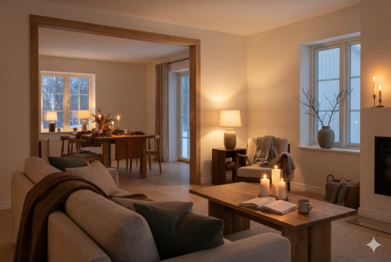
#1 Glowing Golden Autumn Warmth
The Sun-Baked Hearth Palette
An enveloping autumn-warmth scheme that uses an earthy, historic tan base to seamlessly bridge your neutrals and rich rust accents.
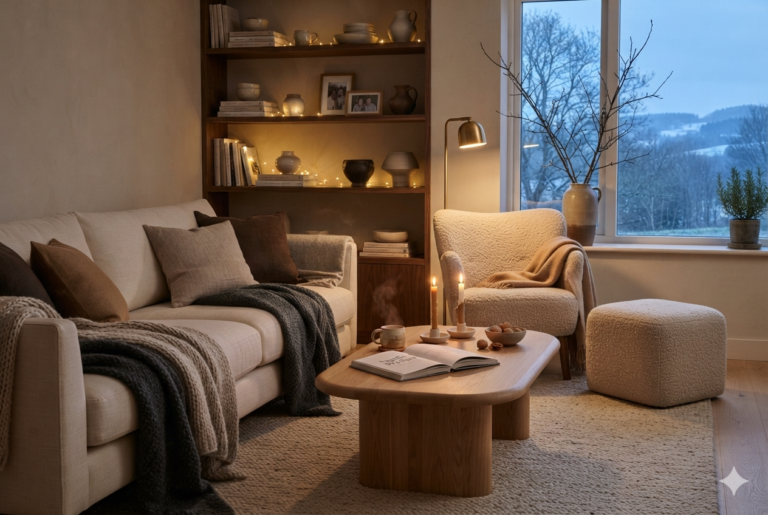
#2 Sheltered in Nature’s Embrace
The Forest Sanctuary Palette
A moody, scholarly scheme using deep forest olive on the walls to make your greige furniture and ochre decor glow beautifully.
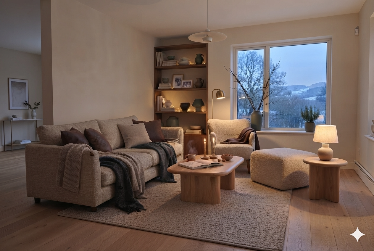
#3 Soft by Daylight, Cozy by Twilight
The Linen & Candlelight Oasis Palette
A balanced, airy layout featuring a soft linen-greige wall to keep the room spacious while making every accent piece independently pop.
#4 Safe, Deeply Grounded Sanctuary (My Personal Pick)
Earthy Winter Hygge Color Palette
A curated, balanced combination designed to turn your living room into a protective, comforting sanctuary.
Earthy Color Palette: What to Skip
Skip using two earthy accent colors at full strength in the same room. Rust and ochre together, both at full saturation, compete rather than complement — pick one as the accent and let the other appear only in a small supporting detail, if at all.
Skip an accent earthy color on too many walls unless you’re prepared to keep everything else in the room really quiet. A full accent wall of Cavern Clay works. All living room walls in Cavern Clay will drive you mad.
Screens oversaturate reds and oranges — the color that looks perfect in a photo often reads more orange than rust once it’s actually mixed and on a living room wall.
Why I Went for Color Palette #4
In the end, it was Astrid who nudged me toward the fourth palette. I had been wavering between the brighter autumn tones and the moody greens, but she reminded me that winter hygge is about feeling safe and grounded.
Her eye for balance—and her insistence on that muted forest accent—made the decision clear.
So the Earthy Winter Hygge Color Palette became my choice, not just for its colors but for the comfort it carries. It feels like a living room wrapped in warmth, a space ready for candlelight, throws, and long evenings together.
And that, really, is the whole point of choosing colors the hygge way.
For the neutral foundation this palette sits on top of, see Warm Neutral Paint Colors for a Hygge Home, and for the full color philosophy behind all of it, the complete guide is here: Hygge Color Palette.
Light a candle. Slow down. Hygge.
— Elise