Warm Neutral Paint Colors for a Hygge Home in Winter
Astrid asks me the same question every year, right around the time the maples on our street start turning. Coffee in hand, standing in our kitchen doorway, surveying the house like she’s inspecting a ship before a long voyage.
“So. Which rooms are getting repainted before winter?”
It’s become a small ritual between us — not because our walls actually need it every year. She has a keen eye for color and a deep understanding of hygge. She knows that a home’s color ages and drifts slightly.
Getting the color palette right is very important to her.
This year the answer was the kitchen, the entryway, and — Henrik’s idea, not mine — finally doing something about the study.
“Good,” she said. “But promise me one thing. Don’t choose any of them standing in the room at two in the afternoon.” [→ Hygge Color Palette]
This website participates in the Amazon Associates program. As an Amazon Associate, I earn from qualifying purchases. It also participates in the Impact and AWIN affiliate programs. If you buy through links on this site, I may earn a small commission at no extra cost to you. Thank you for supporting The Hugged Home.
The Test Nobody Else Runs
Every paint brand and every design blog will tell you to check a color’s LRV — Light Reflectance Value. LRV is a number between 0 and 100 that tells you how much light a paint bounces back into a room.
High LRV, closer to white, reflects more and appears brighter. Low LRV absorbs more and reads deeper and cozier. Sometimes it may appear darker than you expected after it is applied on the wall.
LRV matters, and every color palette guide out there will walk you through checking it against your room’s compass direction.
North-facing rooms need a higher LRV to counter the cool, indirect light; south-facing rooms can carry something deeper since it has the maximum exposure to sunlight. All true. All useful.
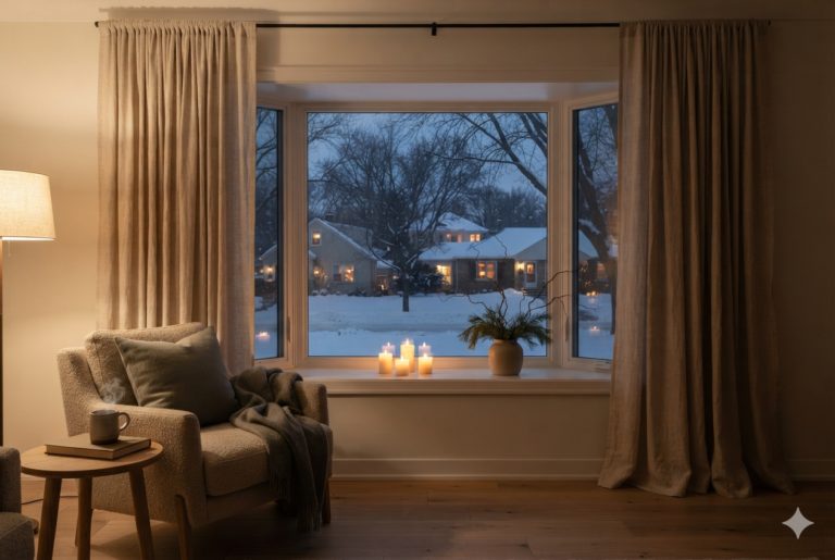
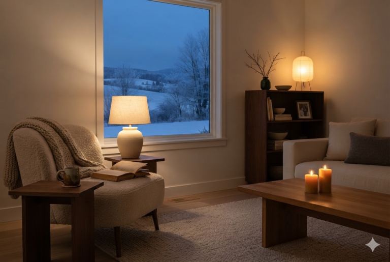
These guides rarely tell you what the color does once the sun’s down and the room is being lit by lamps and candlelight instead.
That’s the test that actually matters in a hygge home, because that’s when the room is actually being lived in.
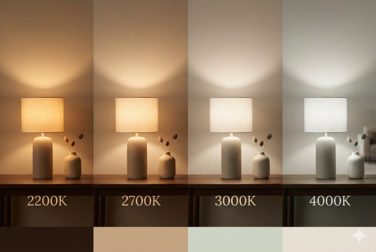
A color that reads warm under a north-facing window at 2 p.m. can go flat and slightly gray when the light source switches to 2700K lamps. The cool gray undertone may take over.
Below are the colors we’ve actually tested under four different light conditions — morning light, harsh midday sun, golden hour glow, and finally lamp and candlelight after dark. [→ Hygge Color Palette]
Warm Neutral Paint Colors for the Kitchen
Kitchens are the one exception to “warmer is always better,” since a kitchen also needs to function under bright task lighting while you’re actually cooking. [→ Layered Lighting: The Complete Guide]
PRESTIGE Paints Interior Paint and Primer In One, Eggshell, (Comparable Match of Benjamin Moore* Ancient Oak*) threads that needle.
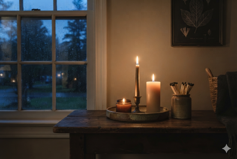
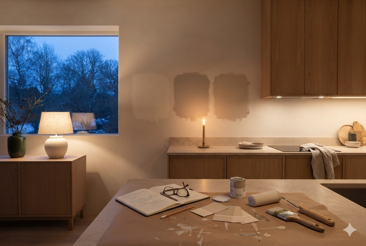
It has a soft, warm pink-beige undertone that keeps the room feeling bright and functional during the day, but doesn’t go stark or clinical once the overhead task lighting is off and it’s just the under-cabinet lights and a candle on the counter for the evening.
Warm Neutral Paint Colors for the Entryway
An entryway takes the most physical abuse of any wall in the house — boots, bags, Björn shaking off snow — which makes it the one room where I’d lead with the deeper option first.
PRESTIGE Paints Interior Paint and Primer In One, Satin, (Comparable Match of Benjamin Moore* Revere Pewter*) is a warm, soft taupe rather than gray.
It has a low enough LRV to be more forgiving of scuffs and handprints than a pale neutral. It holds its warmth even when the entry lamp is the only light on.
If your entryway gets good daylight through a sidelight window or transom, PRESTIGE Paints Interior Paint and Primer In One, Eggshell, Comparable Match of Benjamin Moore* Manchester Tan*) is the softer alternative.
It is warm enough to survive the evening switch to lamplight, without the same “hides everything” darkness of Revere Pewter.
Warm Winter Color Palette for the Study
A study is most welcoming when it is evening-lit by design — a desk lamp, maybe one floor lamp, rarely much daylight if the room’s tucked away from the main windows.
That makes it the room where the candlelight test matters most of anywhere on this list. PRESTIGE Paints Interior Paint and Primer In One, Flat, (Comparable Match of Benjamin Moore* Grant Beige*) is ideal.
A higher-LRV near-white might look crisp and studious at 2 p.m., but it tends to read a little cold and clinical once it is dark outside. Grant Beige appears warm both in afternoon light and evening lamplight.
A quick aside: if “study” for you actually means a reading corner rather than a desk-and-work room, the warm neutral wall color matters less than the lighting layering around it — see the companion piece on building an actual reading nook.
Hygge Home Winter Color Palette: What to Skip
Here is a list of what to skip when deciding on a warm winter color palette to make your home feel comfy and welcoming.
Choosing based on just a chip
Skip choosing a color from the chip alone, even a warm one. A one-inch paint chip under store fluorescents tells you almost nothing. Get a real sample pot and paint at least a two-foot square.
Choosing based on daylight alone
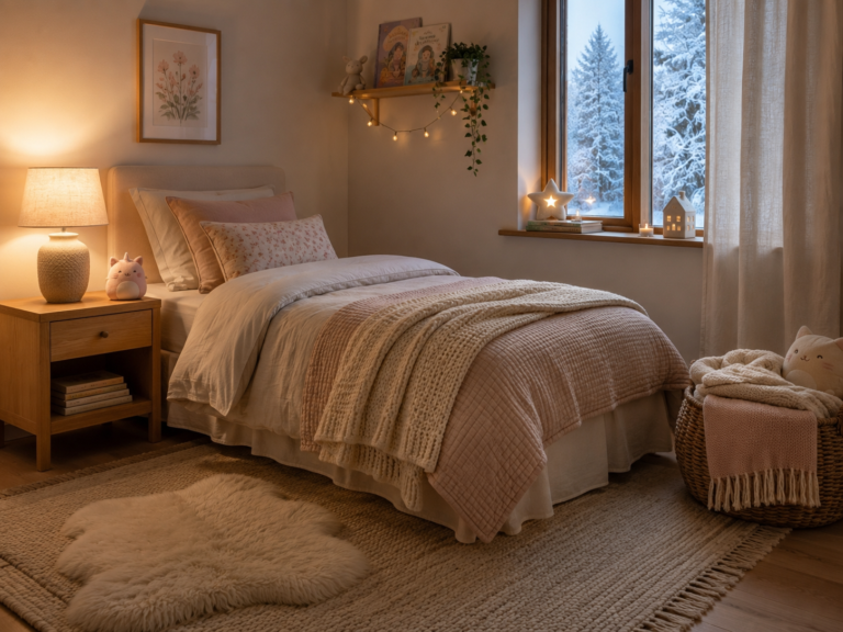
Skip testing only in daylight. Every color on this list looks slightly different than it does in the paint aisle once the lamps and candles are the only light left in the room — and that’s the condition a hygge home actually lives in most evenings.
Choosing a gray undertone
Avoid grays with cool blue or stark black undertones. Under gloomy winter afternoon skies, these colors turn depressing and cold. They also feel cooler under 2700K lamplight. Choose “greiges” or soft taupes that absorb low winter light gracefully, if you must.
Choosing a stark white
Skip pure, bright whites on walls. They reflect the harsh, blinding snow glare from outside, making your interior feel icy and sterile. Swap them for candlelight-friendly shades like warm cream, vanilla, or soft bone.
Choosing high-contrast accents
Skip high-energy neon or electric hues completely. Hygge relies on low-stimulation, calming environments.
Avoid a dominant palette of true, saturated primary red. Instead, opt for complex, comforting winter berry tones like deep cranberry, muted burgundy, or terracotta.
Choosing summer colors
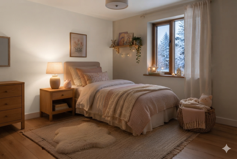
Steer clear of breezy mint greens, cool lavenders, and pastel blues. These colors belong in a summer lakeside cabin, not a hygge-inspired winter refuge.
How We Refreshed Paint Colors Before Winter
Ancient Oak went up in the kitchen the following weekend, Revere Pewter in the entryway the weekend after.
The study is still just two sample paint squares, Sherwin-Williams* Accessible Beige* and Benjamin Moore* Grant Beige*. Henrik can’t make up his mind. We will see how it goes.
Astrid came back the evening the entryway was finished. She didn’t say much — just smiled as she gave the entryway and later the kitchen an inspection.
I understand her two o’clock rule now, the way she said I would. A color that only has to survive daylight is answering the easy question. The one that still feels right at eight at night, lamps on, candles lit, is promoting the hygge home decor. [→ Hygge Home Decor]
For the full framework behind choosing any of this — the biophilia, the four-day test, the two rules we build every room’s palette around — see the complete guide: Hygge Color Palette.
Light a candle. Slow down. Hygge.
— Elise