The Hygge Color Palette: Earthy Neutrals for Winter Warmth
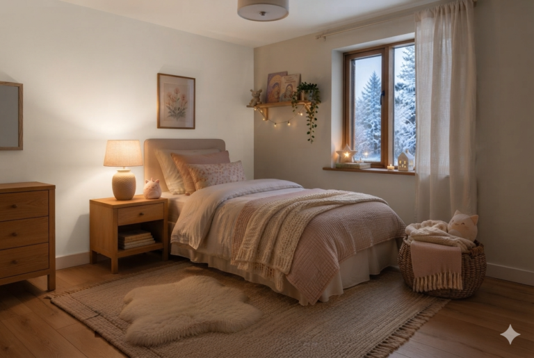
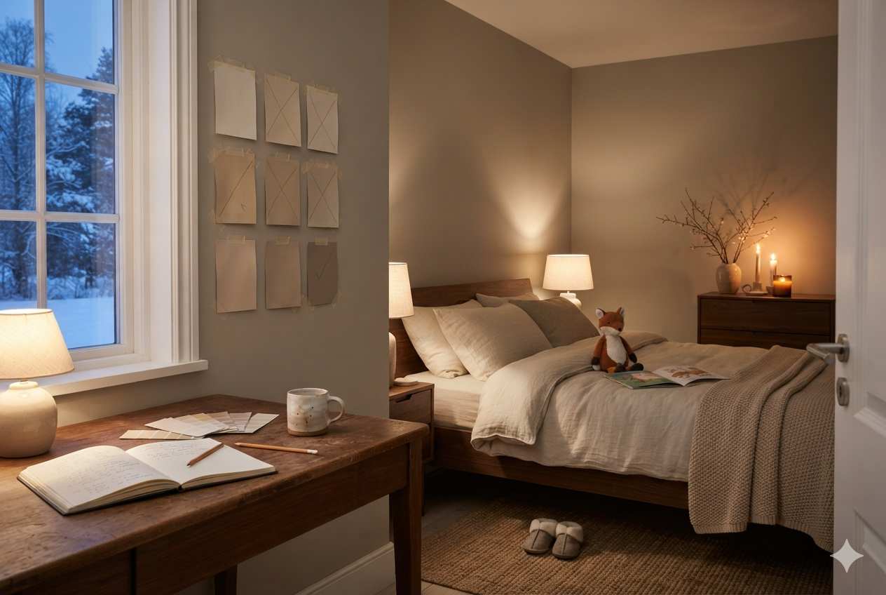
It was a Friday morning in September, a few years ago. There were nine paint swatches taped to Freya’s bedroom wall in a rough grid. Henrik and I had picked the swatches from the store a few days earlier, but we still couldn’t make up our mind.
My friend Astrid has a keen eye for colors and home decor. So I called her over for advice. She came, she looked, and she crossed out five out of the nine.
“I am not done yet,” she said. “I will be back in the evening.” True to her word, she came, rearranged the shortlisted swatches, and taped two new ones she had brought next to them.
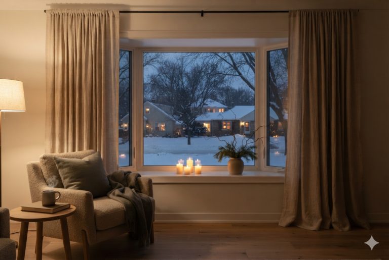
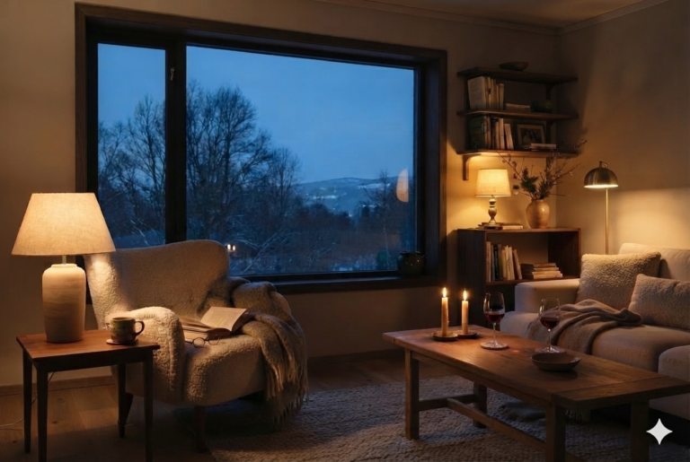
Then she turned off the overhead light, turned on all the lamps, and lit three candles on the coffee table. “Now, pick your color,” she said. Both Henrik and I picked the same swatch. Astrid just smiled.
This was a masterclass in hygge color palette selection.
This website participates in the Amazon Associates program. As an Amazon Associate, I earn from qualifying purchases. It also participates in the Impact and AWIN affiliate programs. If you buy through links on this site, I may earn a small commission at no extra cost to you. Thank you for supporting The Hugged Home.
The Psychology Behind the Hygge Color Palette
The science behind a hygge color palette relies heavily on evolutionary psychology and biophilia. Warm, earthy colors like terracotta, sand, moss green, and warm beige trigger an immediate neurological calming effect.
Biologically, our ancestors associated these specific hues with resource-rich, safe landscapes—such as fertile soil, shelter, and predictable seasonal cycles.
“Earthy colors, like soft greens, warm browns, and muted terracottas, are just inherently comforting. They connect us to the natural world and give us a sense of stability and peace that’s a direct antidote to modern chaos.”
Low light frequencies—such as the soft amber and warm orange glow of fire and candlelight (typically around 1800K)—induce the natural production of melatonin, preparing the body for rest and deep physical relaxation.
In contrast, harsh, artificial cool-toned colors such as stark white, steel gray, and icy blue induce alertness and tension.
These psychological triggers of alert focus and clinical order make cool shades the industry standard for hospitals, offices, and manufacturing floors, where efficiency and visible cleanliness take absolute priority over relaxation.
The Holistic Danish Approach to Color
I quite liked the way Astrid explained the relation between wall color, textures, and lighting. I spent several afternoons understanding how Danes actually chose colors for their homes. Below is the gist of what she told me.
For Danes, choosing a home’s color palette is never just about a single paint swatch. It’s a holistic, atmospheric decision. With Nordic winters long and dark, colors are selected for how they interact with light and textures. [→ Section: Lighting]
Danes view a room as a living ecosystem where the walls, upholstery, and wood tones must work together to maximize warmth and comfort.
The walls serve as the canvas for catching scarce natural light during the day and the warm glow from the fireplace and candles, after sunset. Soft, light-reflecting, warm, earthy color backdrops are natural choices.
Once the warm, earthy paint color is chosen for the walls, Danes will layer tones with, maybe, a golden‑tan leather armchair, a charcoal wool rug, or a terracotta clay planter. [→ Section: Textiles & Texture]
Crucially, the final palette is always determined by how it transforms at dusk. Danes intentionally choose wall undertones that soften under warm, low-placed lighting.
As night falls, and lamps and candles get lit, the entire room feels smaller, safer, and wrapped in hjemlig (homeliness).
Two Color Rules in Our Home
Consistent Palette Across Rooms
The palette across my home stays within one family — espresso, walnut, sand, cream, warm stone — so moving from room to room feels seamless, never abrupt.
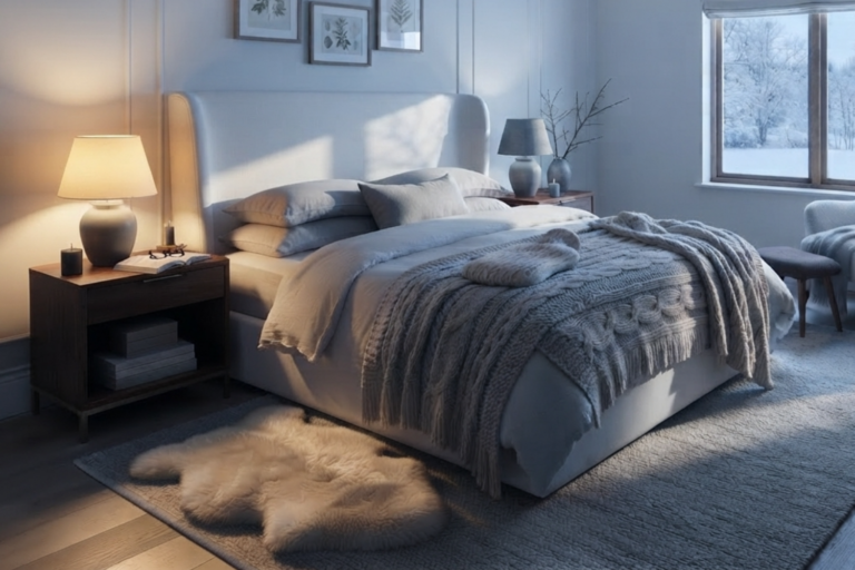
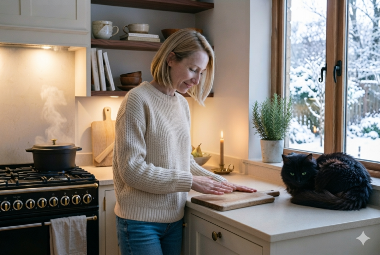
Each space — kitchen, bedroom, living room — carries its own shade, but they’re clearly siblings, not strangers. [→ The Hygge Kitchen] [→ The Hygge Bedroom]
Testing Swatches in Real Light
After we pick up about a dozen paint swatches, Henrik tapes them to the wall that will get painted.
We leave them up for at least four days to see how each shade looks under different light conditions — morning light, harsh midday sun, golden hour glow, and finally lamp and candlelight after dark.
Colors that fail under candlelight are the first to go, followed by those that don’t hold up in golden hour, then those that falter in morning light.
Finally, Henrik and I pick one from those that remain on the wall after four days!
The Complete Guide to Choosing a Hygge Color Palette
Choosing a room’s color palette shouldn’t start and end with a static mood board. True hygge is an atmospheric ecosystem where the look of walls, upholstery, and wood tones shifts from natural daylight to warm evening lamps.
To create a space that feels deeply comforting rather than cold and clinical, you must work from your permanent architectural anchors outward.
This guide breaks down the strategic, step-by-step process for selecting base tones, auditing your room’s unique daylight patterns, and layering natural materials.
Use it to arrive at a hygge color palette that honors both the biological warmth of biophilia and the emotional security of hjemlig comfort.
To build an authentic, cohesive space, you must work from the hardest-to-change architectural elements to the easiest, ensuring your palette feels like one continuous thought.
The Fixed Architectural Anchors (Base Tones)
Before touching a paintbrush, evaluate the permanent elements already in the room. These raw material undertones dictate the base tone of your entire palette.
- 1. Start With Cream, Not White: A true white is clinical and should be totally avoided. A soft cream or warm off-white gives the same brightness with an undertone that the evening light can actually work with. [→ Nest List: warm neutral paint picks]
- 2. Walnut and Espresso for Trim and Furniture: Deep warm browns anchor a room the way a cream or sand wall cannot do alone. Trim, a wood floor, or a single large piece of furniture in walnut or espresso works as an accent.
- 3. Sand and Stone for In-Between Surfaces: Countertops, tile, and larger textiles do best in the sand-to-stone range—warm enough to belong, neutral enough not to compete with a wall color or a rug doing more of the visual work.
The Daylight Audit (Room-by-Room Notes)
Natural light is a dynamic catalyst, completely altering how colors behave. Assess the direction your windows face before finalizing your choices.
- 4. North-Facing Rooms Need the Warmest Undertones: Rooms that only ever get indirect, bluish daylight need the most help from their wall color. Lean warmer here than you think you need to—the room’s own cool light will pull it back toward neutral anyway.
- 5. South-Facing Rooms Can Handle a Slightly Deeper Tone: A room already flooded with warm afternoon sun can carry a richer, slightly deeper neutral without ever feeling dark, since it is getting help from the window most of the day.
- 6. Keep the Palette Consistent From Room to Room: A different color story in every room makes a home feel like a series of unrelated showrooms. Staying within one warm family—even with each room its own shade—makes the connection.
Understanding Undertones & Testing
The biggest mistake is choosing a paint color in the artificial glare of a retail aisle. You must test colors across changing light conditions over several days.
- 7. Check the Undertone in Bright Natural Light First: Hold the swatch against a plain white sheet of paper in daylight. A warm color will show a cream, yellow, or pink bias; a cool one leans blue, green, or gray even if it looked neutral on the card.
- 8. Buy the Sample Pot, Not Just the Chip: A one-inch paint chip is a starting point. Once you have shortlisted, get sample pots. A painted sample board, moved around the room over a few days, tells you more than a swatch could.
- 9. Watch for Green or Gray Undertones Turning Cold at Night: Some warm-looking daytime neutrals have a hidden green or gray base that only shows up once natural light disappears. This is exactly why a four-day, all-hours test matters.
Statement Furniture & Where Color is Allowed
True hygge color design rejects artificial, matching perfection, allowing color to enter the space through organic, low-saturation variations.
- 10. One Deeper Color, Used Sparingly: A single deeper tone—a rust cushion, a forest-green throw, a single dark wall in a small room—reads as intentional against a warm neutral base. The same color used everywhere would look garish.
- 11. Let Natural Materials Do the Rest of the Color Work: Wood grain, wicker, and stone all carry their own subtle variation in tone. A room does not need much added color once the materials themselves are doing part of the job. [→ The Complete Guide to Choosing Natural Materials]
- 12. Avoid True Black in Large Doses: A little black—a lamp base, a picture frame—grounds a warm palette nicely. A large black surface absorbs almost all the light hitting it and can make a small room feel like it is shrinking rather than settling.
What We Now Know
A hygge color palette is not about chasing trends or matching swatches on a board. It’s about creating a living atmosphere that respects the light conditions, embraces natural undertones, and honors the quiet comfort of home.
By testing colors in real conditions, layering warm neutrals, and letting natural materials carry subtle variations, we built a space that feels timeless.
Astrid has taught us that color is more than decoration — it’s a daily companion, shaping how we rest, connect, and feel secure.
When chosen with care, a hygge color palette becomes part of the home’s story, aging with beauty and grace. [→ The Complete Guide to Hygge Home Decor]
Light a candle. Slow down. Hygge.
— Elise