8 Warm Winter Color Palette Ideas Inspired by Hygge Home Decor Trends
We hosted our first dinner of the season last weekend — nothing fancy, just Astrid and our new neighbors.
Astrid did her usual slow walk-through before the others came, wine glass in hand. Entryway, living room, dining room, and kitchen. Then she asked if we could take a look upstairs.
“Of course,” I said and led her up the stairs to the landing, study, Maja and Freya’s rooms, and finally our bedroom. She even took a peek in our bathroom. She had that look she gets after a house tour, about to say something I’d end up writing down.
“You know,” she said, “you’ve painted three rooms this season, and I don’t think you need to paint anymore, not this season at least.”
I asked what she meant. She pointed at the runner on the dining table, the cushion covers on the window seat, the candles on the mantle — none of it wall paint, all of it warm, all of it new since October.
“The color of a hygge winter home,” she said, “doesn’t have to live on the walls only.”
This website participates in the Amazon Associates program. As an Amazon Associate, I earn from qualifying purchases. It also participates in the Impact and AWIN affiliate programs. If you buy through links on this site, I may earn a small commission at no extra cost to you. Thank you for supporting The Hugged Home.
A Warm Winter Color Palette: Look Beyond Paints
Maybe Astrid had a point. We had already repainted the kitchen (Ancient Oak) and the entryway (Revere Pewter) [→ Warm Neutral Paint Colors].
The living room now has a soft glowing French Vanilla that is so grounding under candlelight [→ Earthy Color Palette Ideas], and Maja’s bedroom is finally painted with Edgecomb Gray and White Dove that “don’t talk” to her when she is ready to sleep. [→ Neutral Bedroom Color Palette].
So, as Astrid pointed out, a warm winter color palette was not just about paints and walls. There is a lot more you can do without picking up a paintbrush, or if you already have walls you are happy with.
The other elements of a warm winter color palette – textiles, candles, ceramics – are equally instrumental in creating a cozy, warm, and welcoming hygge home during the cold winter.
Start the Process in Fall
There’s a reason this works so well right as the season turns. The same instinct that pulls us toward rust and ochre once the leaves change — the leaf-pigment science behind why an earthy palette feels inevitable rather than decorated — applies just as much to a cushion cover as it does to a wall. [→ Earthy Color Palette Ideas]
The difference is commitment. A wall is choosing that feeling for a few years. A new runner or a throw is a seasonal choice. It’s the easier, lower-stakes way to usher in warmth and coziness in your home, before the bleak winter arrives.
Trending Warm Winter Color Palettes, Room by Room
Living Room
#1 Sunshine in Forest.
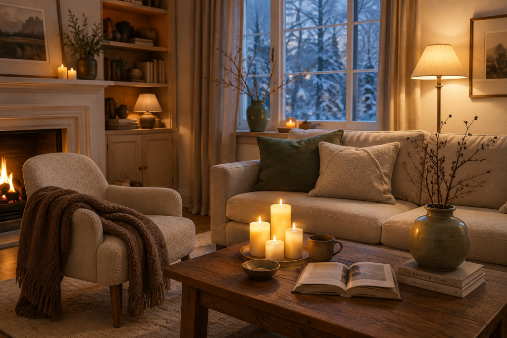
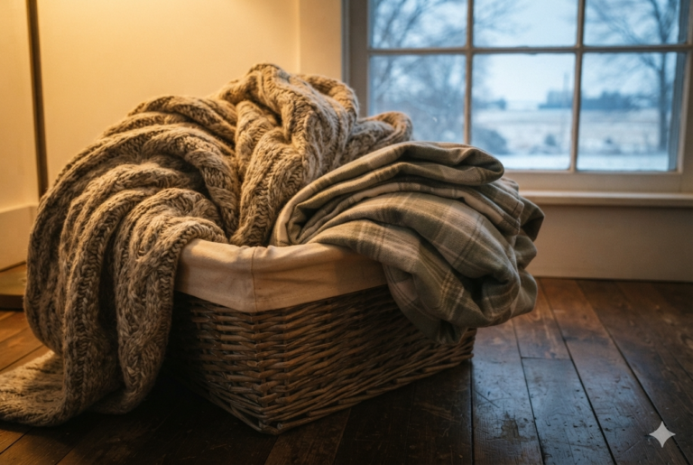
A chestnut-brown bouclé throw echoes the roasted chestnut accent already on the built-ins, casually folded over the armchair.
Two cushion covers — one in a deep forest-floor sage, one in soft oatmeal — sit against each other on the sofa. They do not match, on purpose.
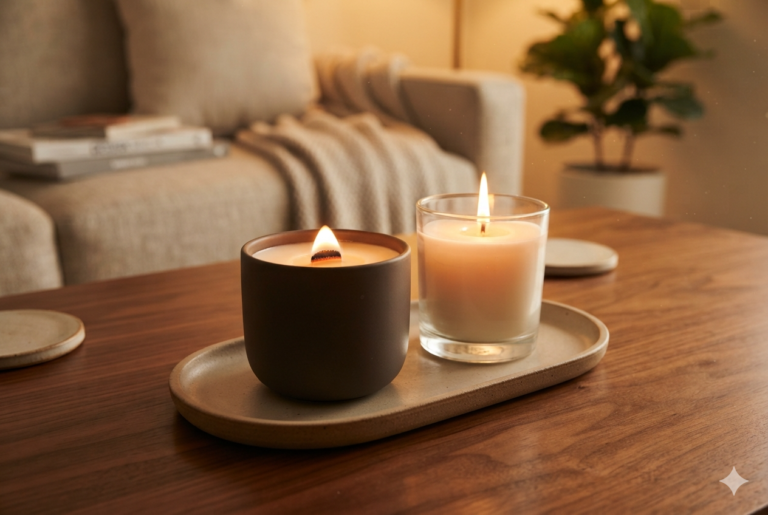
A cluster of unscented French vanilla pillar candles sits low on the coffee table. The candles, candlelight, and wall color add a glow and complement each other.
One sage-green stoneware vase, echoing a forest floor, holds nothing more than a few bare branches brought in from a neighborhood walk and rests on the windowsill.
#2 Chestnut & Amber.
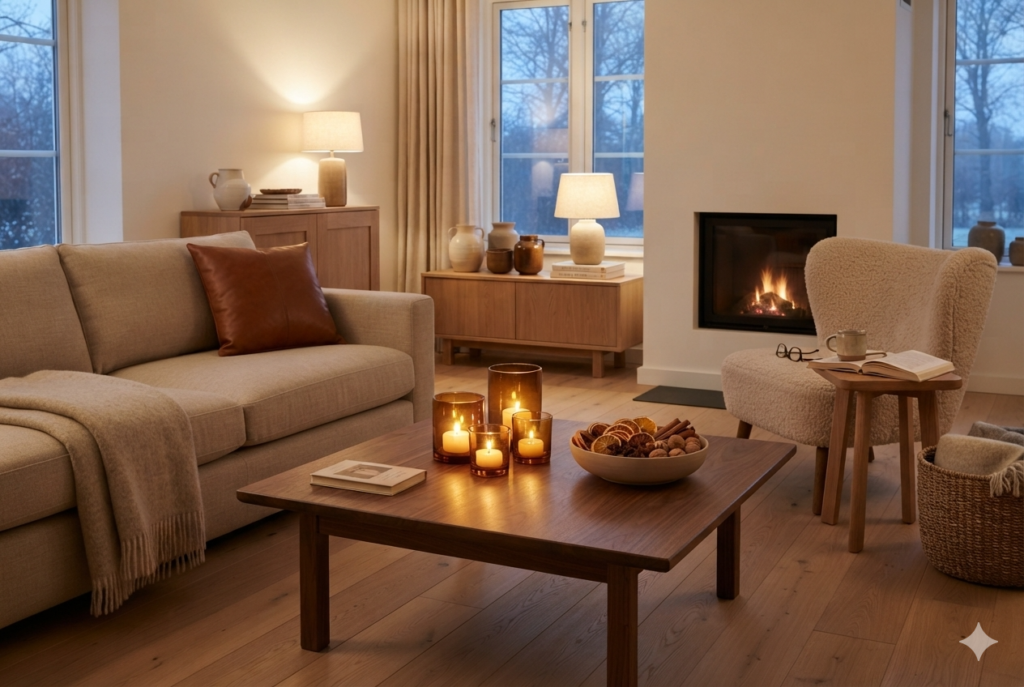
The warmer variant, for evenings that want a bit more glow than sage-green allows. An oatmeal wool throw stays neutral so a single roasted chestnut leather-look cushion can do the talking.
Amber glass votives replace the pillar candles here, three or four scattered rather than clustered, and a toasted almond ceramic bowl on the side table holds dried orange slices and a cinnamon stick or two — as much a scent choice as a color one.
Bedroom
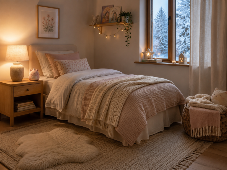
#3 Oat & Clay.
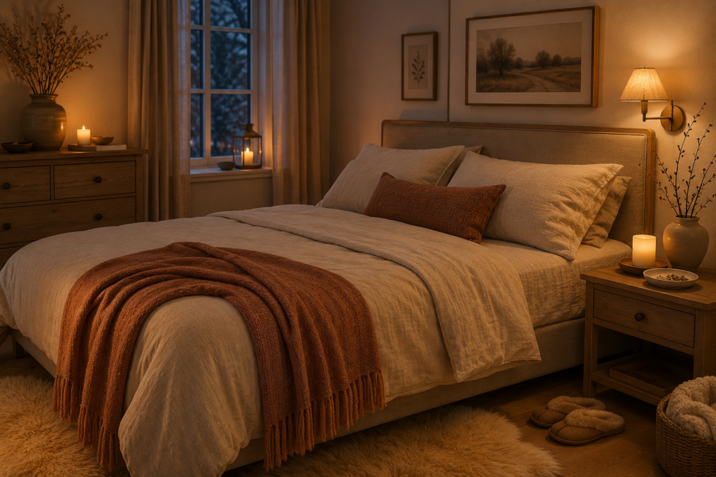
Bedroom walls should already be doing the calm, low-chroma work, to reduce chatter and bring on sleep [→ Neutral Bedroom Color Palette].
The textiles here stay deliberately quiet to ensure falling asleep is natural and easy. An oatmeal linen duvet cover, one small muted clay-toned throw folded at the foot of the bed, and a single flameless candle on the nightstand.
A small white-dove ceramic dish by the lamp holds rings, hair clips, and possibly the wristwatch. A sheepskin rug in a slightly deeper shade, more like pale straw, lies beside the bed to welcome you in the morning.
#4 Soft Birch & Cream.
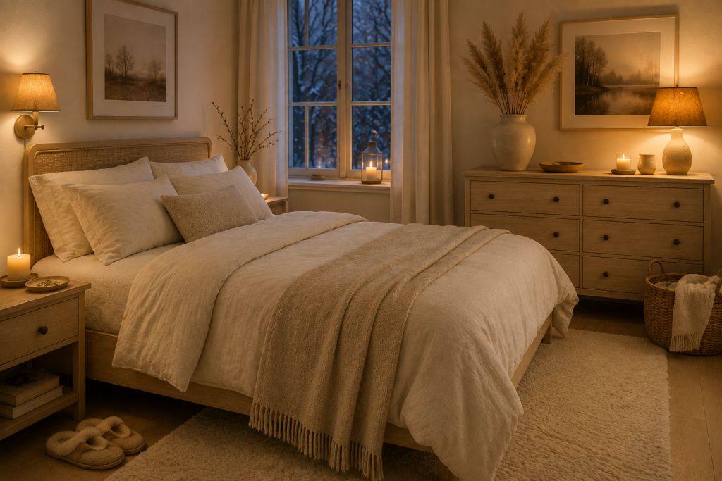
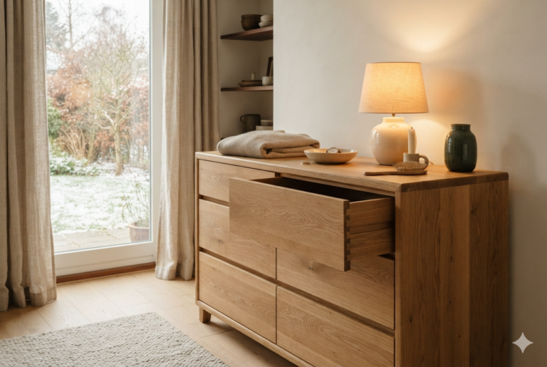
The palette here leans into pale birch and cream, keeping the room light and restful. A birch‑and‑cream duvet set forms the quiet foundation, while one small amber‑toned lampshade warms the light itself instead of adding a bold textile.
On the dresser, a cream stoneware vase holds a few dried pampas stems—deliberately sparse. Beside it, a shallow birch‑wood tray keeps everyday pieces—rings, hair ties, or reading glasses—contained without clutter.
Underfoot, a soft wool rug in a wheat‑husk shade adds warmth without breaking the calm. The tones stay muted, but the layering of birch, cream, amber, and wheat creates depth.
Dining Room
#5 Spiced Chai Harvest.
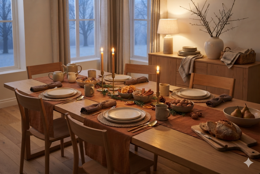
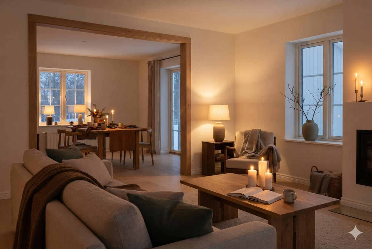
A cinnamon‑toned linen table runner anchors the table, with clove‑brown cloth napkins rolled rather than folded flat.
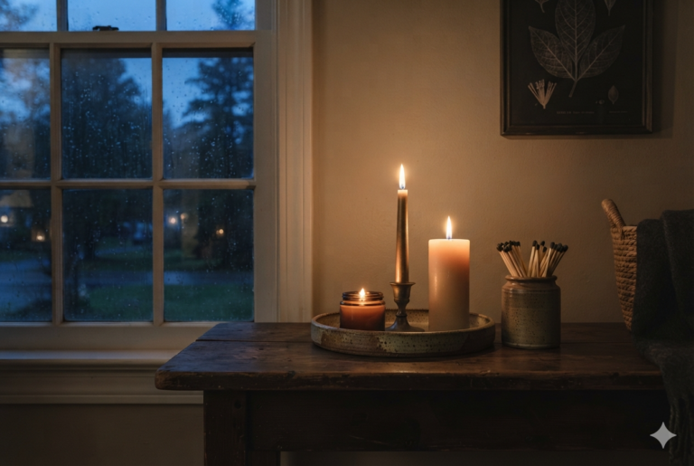
Taper candles wrapped with a single cinnamon stick and a length of twine sit in a low brass holder—kept low enough not to block conversation across the table.
Clove‑brown stoneware mugs, left out rather than stored, double as a centerpiece alongside a shallow bowl of dried apple rings and whole nutmeg pods.
This palette works as much through scent as through color—warm spice and earthy tones layered together.
#6 Cranberry & Cream.
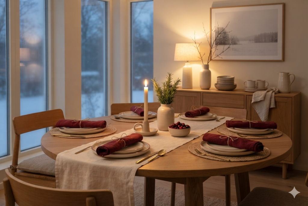
The more festive option, best suited to a table that hosts through the season. A cream linen runner stretches across the table, grounding the setting beneath deep cranberry napkins, rolled neatly for each place.
Cream taper candles stand tall in almond ceramic holders, a softer alternative to the cinnamon‑wrapped ones, their glow kept low and steady. Cream stoneware charger plates edged with a thin cranberry rim provide the only patterned detail, subtle but celebratory.
A cluster of frosted cranberries in a shallow cream stone bowl, paired with a few sprigs of rosemary, completes the centerpiece.
The pairing adds fragrance and color at once—bright berry red softened by herbal green—bringing warmth and welcome to the table without overwhelming the calm balance of cream and cranberry.
Kitchen
#7 Amber Jar.
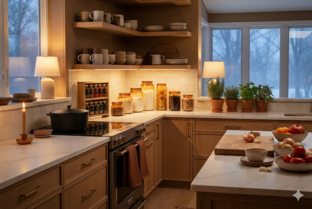
Against the kitchen’s Ancient Oak walls, amber glass canisters line the counter, catching the light and shifting the whole tone without touching a single cabinet.
A spice rack beside the canisters keeps everyday flavors within reach, its rows of amber jars filled with cumin, coriander, and paprika adding both function and visual rhythm.
On the open shelving, oak‑brown stoneware mugs pick up the wall color directly, grounding the palette in everyday use.
On the windowsill, a mini indoor herb garden—parsley, thyme, and rosemary in small terracotta pots—adds freshness and fragrance, softening the darker tones with living green.
Rust‑toned waffle‑weave dish towels draped over the oven handle add texture and warmth, their color echoing the jars. A single beeswax candle in a low amber holder flickers softly on the kitchen counter.
#8 Copper & Clove.
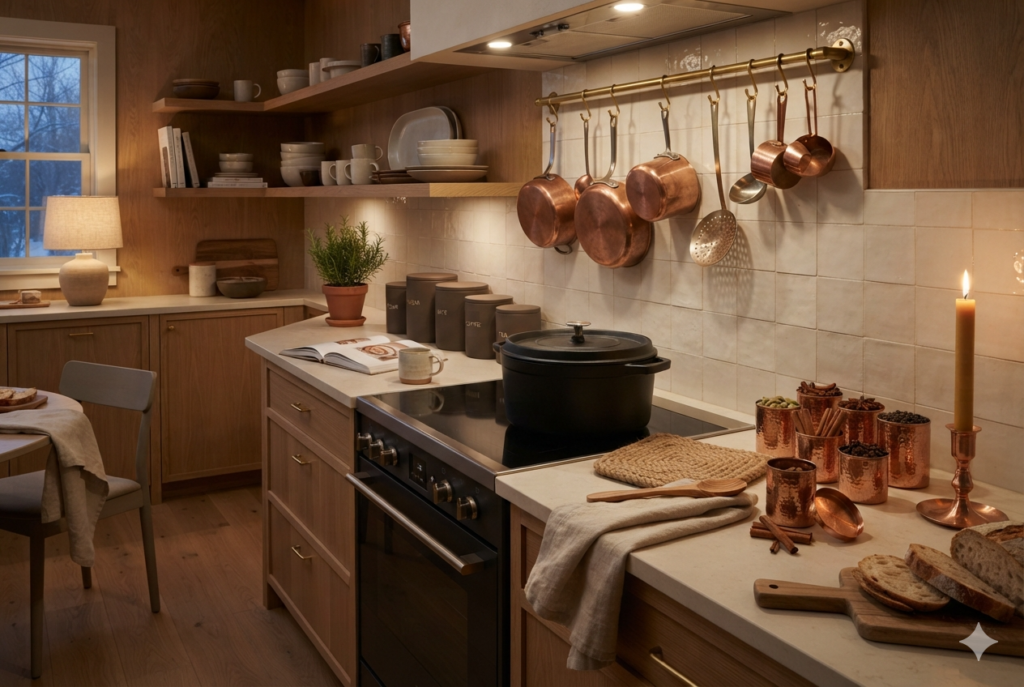
The cast-iron Dutch oven on the kitchen stove — its black finish is the grounding this palette builds around.
A few pieces of copper cookware — a saucepan, a ladle, whatever you already own — hung on a rail nearby, catching the kitchen lamp light against the kitchen’s Ancient Oak walls.
A set of clove-brown stoneware canisters for flour and sugar, and a woven jute trivet by the stove, add texture.
Copper jars of cardamom, cloves, and cinnamon fill the kitchen with an aroma whenever a lid is opened. And in the corner, a single beeswax pillar candle in a copper holder flickers softly, its glow reflecting off the cookware.
The Real Reason Textiles & Ceramics Beat Repainting
Wall paint is a fixed choice. It has to work through every season, often for years. Textiles and ceramics don’t carry that burden. A cushion cover or table runner can be bold, seasonal, and temporary.
That’s why high‑chroma colors—true cranberry, deep ochre, rich rust—belong on textiles more than walls. A saturated wall is a five‑year commitment. A saturated cushion cover is a three‑month experiment.
That freedom is what makes palettes like Cranberry & Cream possible in homes while the walls stay warm neutral.
There’s a practical side too. Painting a wall takes effort and time, typically a weekend or more per room. Textiles, ceramics, candles cost less, take minutes to arrange, and can be packed away when the season turns.
They’re the lower‑risk and easier way to refresh a room without regret.
Warm Winter Color Palette Ideas: What to Skip
- Buying a whole new set for every room — pick one accent color and let two or three pieces of it move between rooms instead.
- Matching every piece too exactly — a runner and a mug in the same shade of cinnamon is not a necessity. Slight variations actually add interest.
- Ignoring the room’s existing undertone — hold a new piece up against the room’s actual wood tones and, where you have one, its wall color, before buying.
- Treating it as permanent — pack the runner and the cushion covers away with the season. Leaving them out year-round will strip them of feeling seasonal in the first place.
How I Warmed Up Every Repainted Room
The three rooms we’d already repainted this season didn’t need more color — they needed textiles and ceramics to catch up.
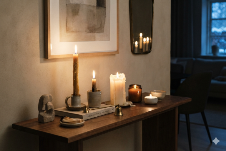
The kitchen’s Ancient Oak walls got the Amber Jar treatment: canisters and towels in, nothing else changed. The entryway’s Revere Pewter got a small amber-glass dish for keys, the one purely decorative object on that console.
The living room’s softly glowing French Vanilla walls got a bit of the forest — the chestnut throw, the sage and oatmeal cushions, and the pillar candle cluster.
The dining room and kitchen got touches of Spiced Chai Harvest between them — the same clove-brown mugs doing duty in both rooms, the cinnamon and dried orange doing as much for how the house smells during a dinner party as for how it looks.
The study, still just Accessible Beige, we left alone entirely this round. Some rooms can wait for the next year.
Maja’s room stayed exactly as it was. Some rooms, once they’re right, don’t need a season added on top. She’s still sleeping through the night in there, with just the change in wall paint color.
For the full color philosophy behind every room in this house — the four-day test, the two anchor rules, and how it all fits together — see the complete guide: Hygge Color Palette.
And for the whole picture of how every room in this house works toward the same feeling, see Hygge Home Decor.
Light a candle. Slow down. Hygge.
— Elise